Font Choices And Justification
ghhhrhryt 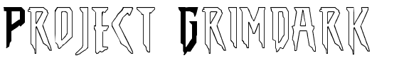
|
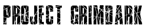
We have looked at this font called Broken Glass but decided against it as it is too different from the font we have used in relation to our film before.
We then looked at The Amazing Spider-Man font but decided that this looked a little bit too cartoony and not right for the genre of horror. We looked at this font that is called N&D that looks like our logo font however it would be better if we could find a font closer to it. this is because although there are similarities it is clearly a different font, We found a font called Prometheus that is the closest match to our logo. This is a modern design which will reflect our idea of being modern. We have found that if you write in lower case, then the text skips out on letters. But that does not happen if we write in upper case, so we will write the title in upper case, like we have on the logo. |
RB, RD, RM
